Thursday 25 July 2013

Plants on the Window Sill

I saw this image on the web and It really grabbed me and instantly I knew it would be one of those images that would hold my interest for a while and inspire me to produce multiple paintings of it.

If you've read my posts over the last couple of months you will know I've been practising watercolour painting with a Hake brush. I started off using a 1.5" inch brush on 11 x 9 inch paper and was baffled by it! My reaction was to buy a smaller brush and to use bigger paper. I acquired the 1.25 inch and 1 inch Hake brushes and some 14 x 11 inch paper.

I roughly manage to paint skies, trees and fields with the hake and I very slowly seeing its potential. I felt it would be a good exercise to do a still life of something that looks to have fine detail (i.e. the thin leaves on the Spider plant in the image below) and attack this with the Hake brush.

Ron Ranson is, of course, an advocate of the Hake brush and insists that it prevents fiddling and fine detail which it does for the most part, but there's always the temptation to try!

Here's the original image:


The first version of this painting was a pure exercise in using the brush - I had no intention of 'doing a painting' and it was a great feeling! The idea was to simply make an impression of the spider plant with the hake brush.

I love this first version, it means freedom to me. It's a fascinating thing to me that we can do this - to "Not paint a pitcture" -- to just paint because you want to put the brush to the paper, try it and see the results and to not be bothered if it ends up as a finished painting or not :-)


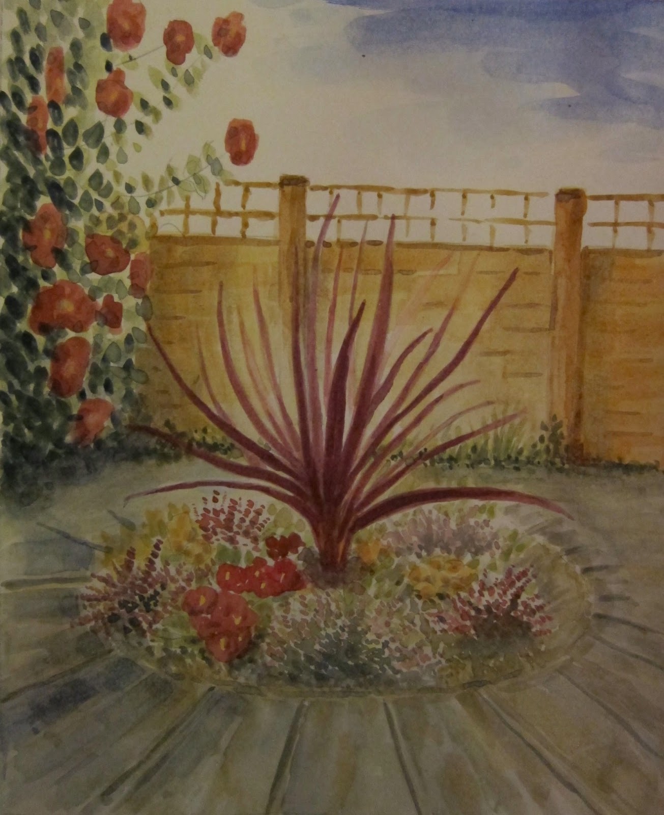
After that brief practise I set about doing an actual painting of the scene. This version was okay but not really happy with the background. When I got to painting the purple part of the plant on the left, I chickened out of using the hake and used a round brush...


I was now in 'round brush' mode again and decided to do a quick study of the spider plant:


I enjoyed doing this version and was happy with the result. I then set about on the final version using No.6 round for the plants and a No. 10 for the background and table. Really like this painting. I'm really happy with the colours and the sense of light and I love the background! :-)


Thanks for reading... see you next time.

Ian.

Wednesday 24 July 2013

Farm Building

My latest paintings are of a farm building taken from a photo found on the web. The website is here: http://www.geograph.org.uk/, the idea behind the website is to catalogue photos of every square mile of the UK. It's quite handy for reference material.

Here's the photo I'm using:


I decided to do a quick sketch to 'just have a go' - to get warmed up and used to the brush:


I decided then to do a thumbnail tonal sketch to get a better idea of tone and composition:


Here's the next version of the painting. I felt happier with this composition, and happy with the feel of the trees.. but as I got to the foreground I already felt that I wanted to do another version, so I kind-of rushed the fence just to finish the painting and get on with the next one!


Here's the final version. A bit muddy and the blue sky is way too bold. It has a certain amount of colour harmony to it I think from the old Steve Cronin technique of wetting the paper all over and slapping a load of raw sienna on first. It has a dusky feel to it.. I think I might call this version "Farm building at dusk with midday sun on the field!!" ha ha.

I used masking fluid for the sheep and water trough, and also for the building itself, so I could paint the background trees wet-in-wet without worrying about the edges of the building. I also masked out the fence on the right. The grasses were scratched out of the wet paint using a piece of plastic card.

I have a few more paintings of still life to upload but I don't have them to hand at the moment - I left them round my folks place..

See you next time and thanks for reading.

Ian.

Monday 3 June 2013

Tunisian Houses

For this painting I used a scanned photograph from a book about Tunisia. It's a lovely book full of amazing images. I also have a book about Israel that is equally inspiring. I pick these books up from charity shops or the recycling centre and are a good source of reference material.

Here's the reference image I used for the painting:

Here's the finished painting - I'm quite happy with this one..


Thanks for reading.. See you next time.

Clay Pots

This watercolour was painted using a reference photograph I took in my parents garden. Two clay pots stood in front of the greenhouse with early morning sun behind the subject. I took inspiration from the lovely shadows and the reflections from the greenhouse -  I immediately felt that the painting should have a semi-abstract background. I'm fairly happy with the painting, although I would like to try another version of this painting and make a lot more of the background and also make the main subject much looser and and more expressive. I feel that the subject is a bit too formal for the loose background so I may have another go at this one.

Here's the reference photo:


Here's the finished painting. Apologies for the slightly iffy scan, I have a slight problem with my scanner - it's producing a missing pixel creating a white line through the image. They are sending a replacement scanner at the moment!


Thanks for reading.. See you next time.

Sunday 19 May 2013

Chimenea

After the two attempts at painting the bowl of flowers, I moved onto another subject that I've wanted to paint for quite a while now - A chimenea in my parents' garden. Heres the photo I'm using as reference:


The painting turned out to be one that I enjoyed the most and I'm really happy with the results. It's in the picture framers as we speak... Really like the flowers and background and the chimenea itself. The bushes on the left are ok I s'pose..

Thanks for reading, see you again soon. There should be another three similarly styled paintings coming up over the next few weeks.


Thursday 2 May 2013

Update to Circular Flower Bed - Ink Pen

I decided to try adding fine waterproof pen to the circular flower bed painting I posted last time. I scanned the painting (as it was A4) and printed it on glossy photo paper and onto this print I added the waterproof pen. The majority of the pen used was 0.1mm with a few thicker lines using a 0.4mm. I do like the end result - the painting was always intended to be a pen and wash, so I will go ahead and apply the pen onto the original painting. It was good to have a practise run and I think I have learnt a couple of things from this trial run.

Hope you like the pen and wash, thanks for reading and I'll see you next time.


Wednesday 24 April 2013

Circular Flower Bed

Hello again and welcome to my watercolour blog. The painting I'm publishing in this post is a view of my parents garden in Topsham - a circular flower bed surrounded by mottled paving slabs.

I'm really pleased with the painting and enjoyed this particular style - I'm not sure what the technical term for this style is - dibs and dabs? I didn't do any background washes nor any real negative painting (creating light shapes by surrounding darker tones).

When I was choosing a reference photo to paint I really fancied doing this one as a pen and wash. I think I will continue and add ink pen to the painting and maybe a few more subtle shadows.

My intention was to photograph the painting in stages and this was successful up to stage 3 but then I became so engrossed in the painting I forgot to photograph any further stages until the finished painting! Oh well, maybe next time...

Here's the reference photo


Stage 1 - Sketch


Stage 2 - Reds


Stage 3 - Greens


Stage 4 - The finished painting


I hope you like the painting and I'll post again soon with pics of the pen and wash.

Thanks for reading.
Ian.

Tuesday 16 April 2013

Added some trees to Bridge Over River Exe

Well, I have to say that the two trees are just way too similar in size, making a symmetrical composition which is a no no! On a positive note I'm quite happy with the brush strokes of the branches and the stippled foliage. The tree on the right does cover up the house that was tucked away in the middle ground trees but I don't think thats such a bad thing really.. For my next post I will do a review of all the materials I use.. and then back to practising some basics such as trees, bushes, hedges, foregrounds, paths and rocks.


Hope you like the painting, thanks for dropping by. See you next time.

Ian.

Wednesday 10 April 2013

Bridge over the River Exe, Topsham

Hello! It's been a while since my last painting -- I haven't really practised rocks, bushes and trees as I had hoped so I haven't painting the rocks at Woolacombe as I planned. I fancied painting a bridge scene taken from a number of new Topsham pictures copied from my Dad's camera.

This painting is quite a bit smaller than my last few, measuring only 10 inches x 7 inches. It is a smooth watercolour paper (Hot pressed). I started out just aiming to do a few sketches of the Topsham scenes and after completing the sketch of the bridge scene, instead of copying to the larger 14" x 10" medium-rough paper I normally use, I decided to paint it there and then.

The smooth, smaller sized paper and using a No. 6 round brush for nearly all the painting had an effect on the style, being more wet on dry strokes leaving edges to the paint rather than the softer feel of wet in wet. I feel really comfortable with this style and enjoy the semi-precision of the houses and bridge achieved with this brush. The top of the sky was painted using a 3/4" flat brush and, as I mentioned, the rest of the painting was using the No. 6 round.

Again I've stopped short with the painting and photographed and blogged it before attempting the trees! I like to think of it as a simple version thats just about worth displaying on this blog...! I will put in the trees, bushes and twigs soon, and post a photo of this in my next update.

Here's the reference photo of the rather nice stone bridge over the River Exe, somewhere near Topsham.


Here's the painting so far with the foreground still to come.


And here's a photo showing a CD to give you the scale and size of the paper.


Thanks for reading and see you soon for my next post.
Ian.

Sunday 17 March 2013

Motorway Bridge - Topsham Devon

For my next painting I've used as reference a photo my Dad took of the motorway bridge spanning the River Exe at Topsham.


I was really pleased with sky and really like the drama and the way it created a focal point in the middle of the painting. The composition is debatable, I think, being very heavy on the mid-ground with very little background, but I still like it!

Here's the finished painting, hope you like it. I may post more thoughts about it later but it's a bit late right now...


Thanks for reading, see you soon.

Ian.

Friday 15 March 2013

Final attempt at the moorland scene

Well... I feel a lot happier with the composition in this attempt at the picture. Really enjoyed doing all three paintings so far and will move on to another composition which I will post about later.

I like some of it more than the other two paintings but there are bits of it that haven't turned out quite as well as the second painting (which I think is the best of the three, even though I prefer this one's composition). Basically it's all about lots and lots of practise! So until next time, thanks for reading and here's the moorland scene: